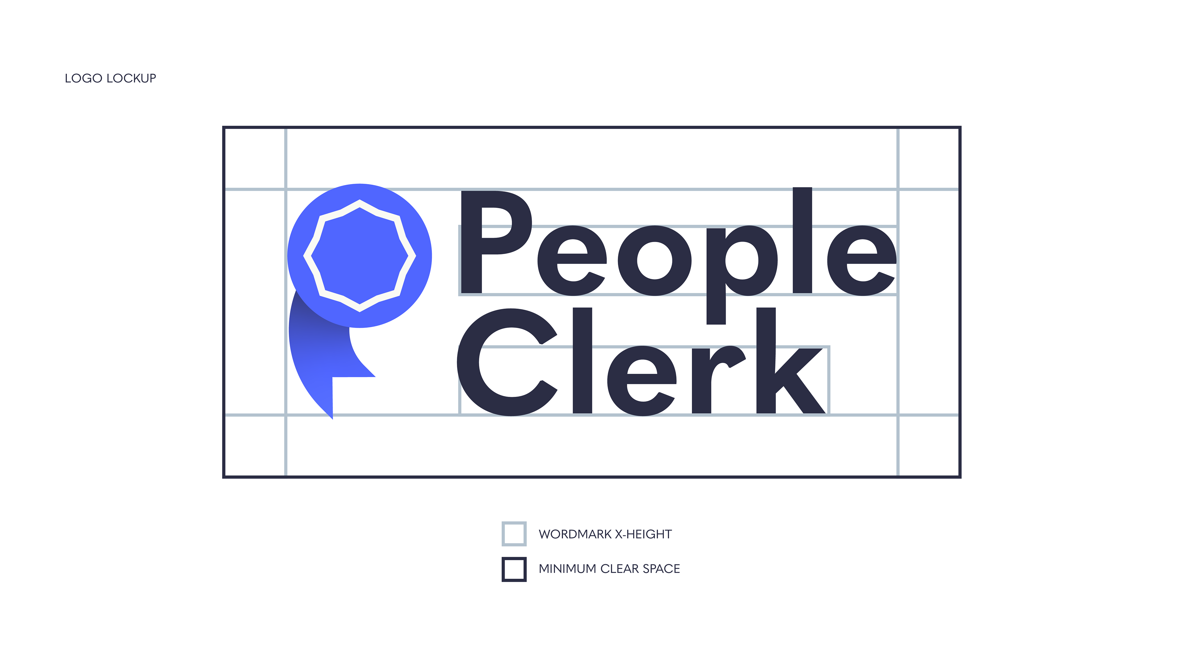
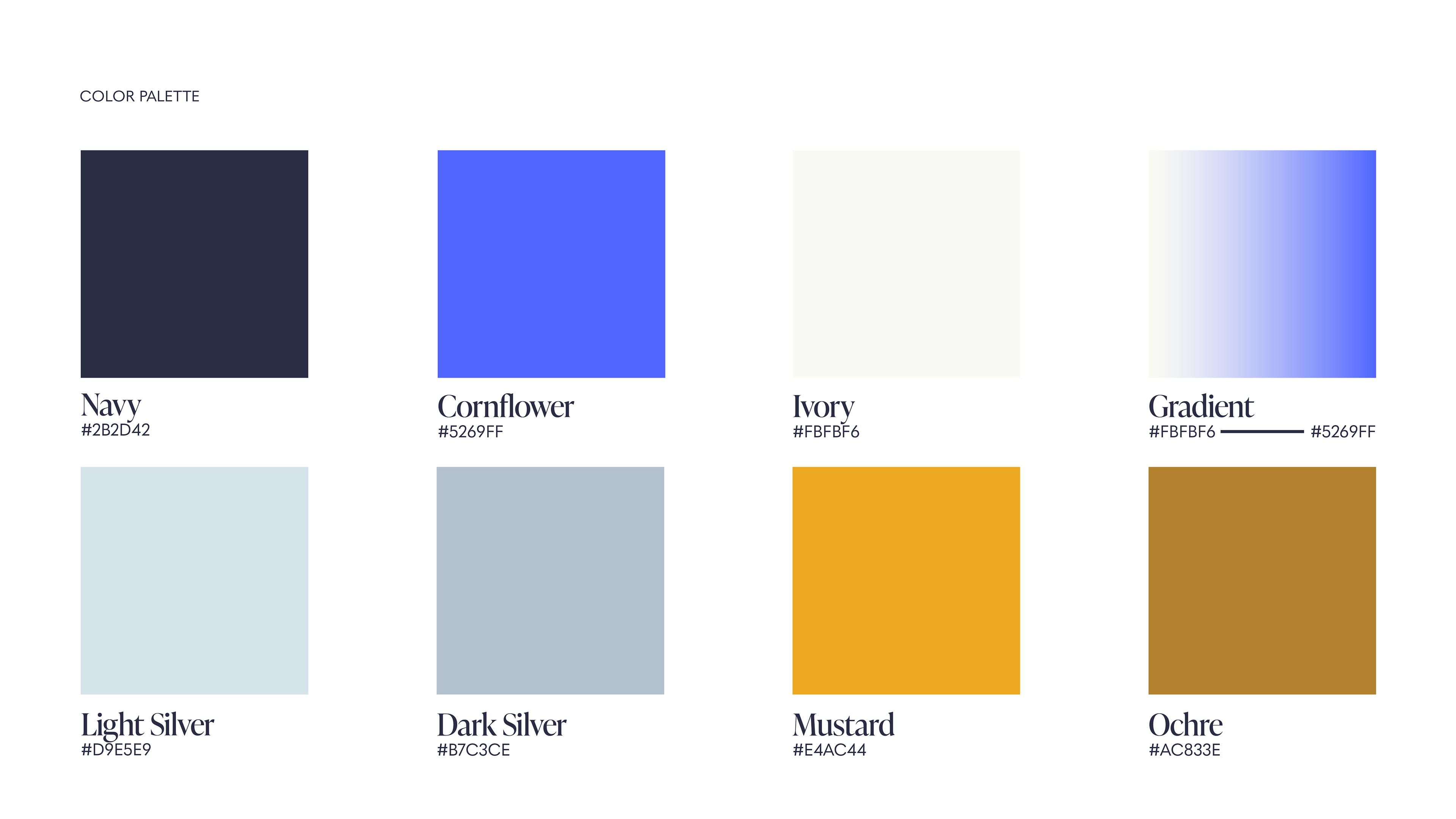
Project: Brand Refresh (Logo/Wordmark, Color Palette, Icon Set, Typography, Collateral)
Purpose: To brighten and build out People Clerk's branding to compete in the legal tech space and enhance their user-facing documentation and product.
People: Michael P. Maerlender (Designer)
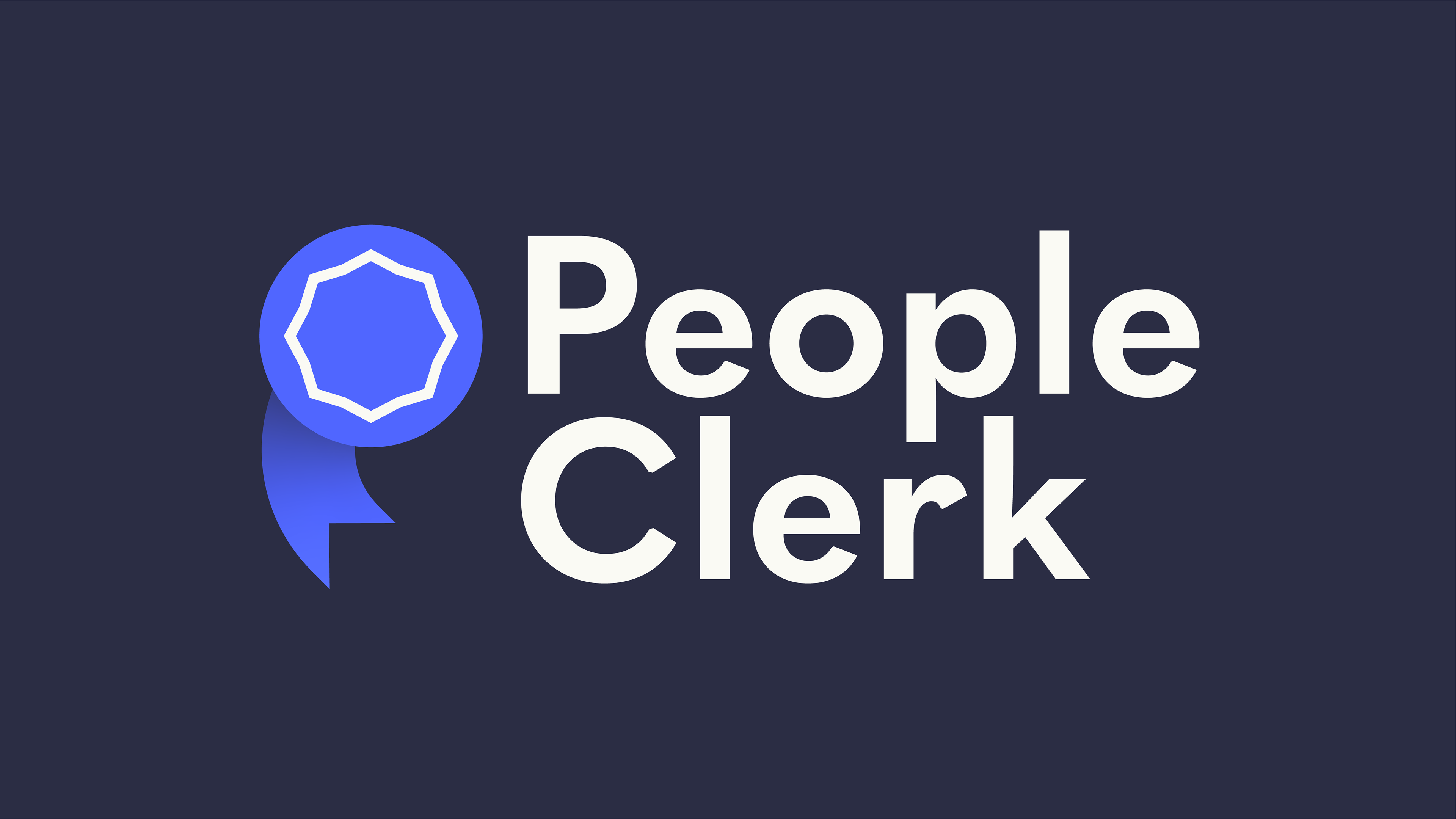

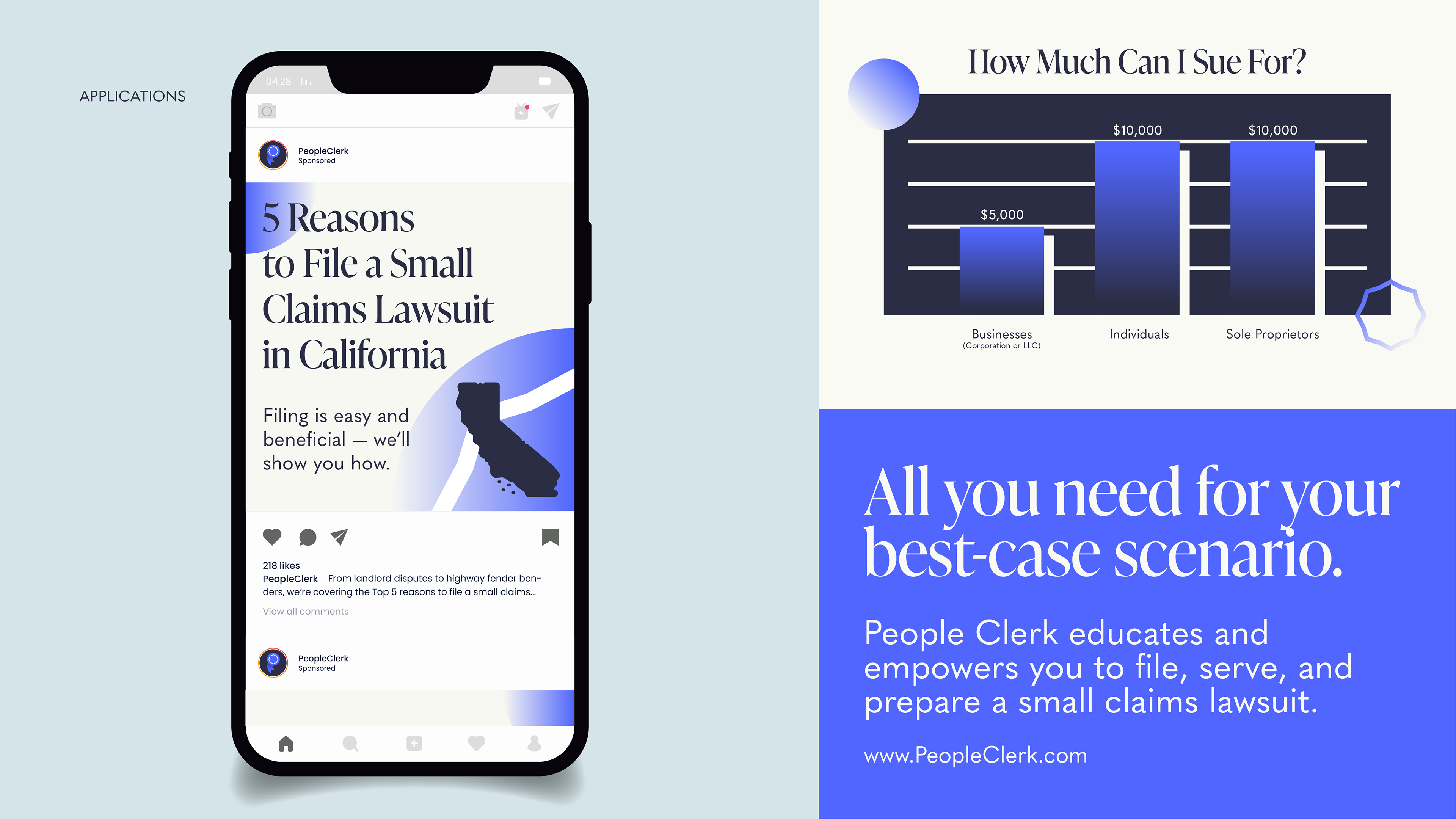
People Clerk is a platform that helps individuals file, serve, and prepare small claims lawsuits without the need for an attorney. The refreshed identity was designed to evoke simplicity, trust, and empowerment to participate in our legal system.
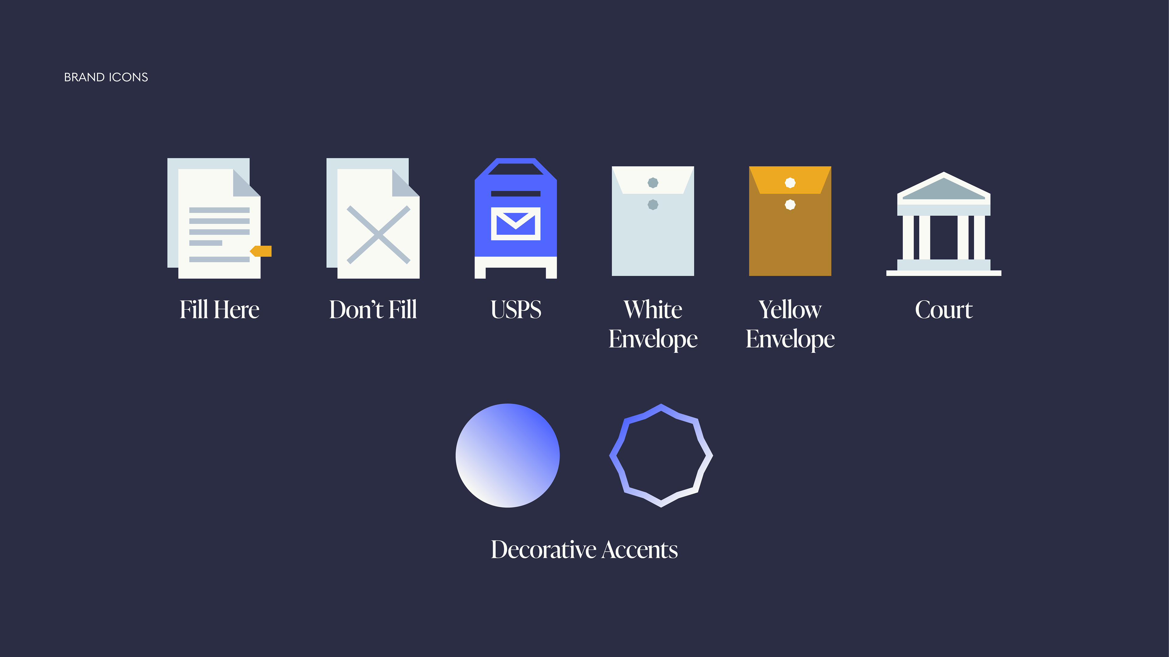
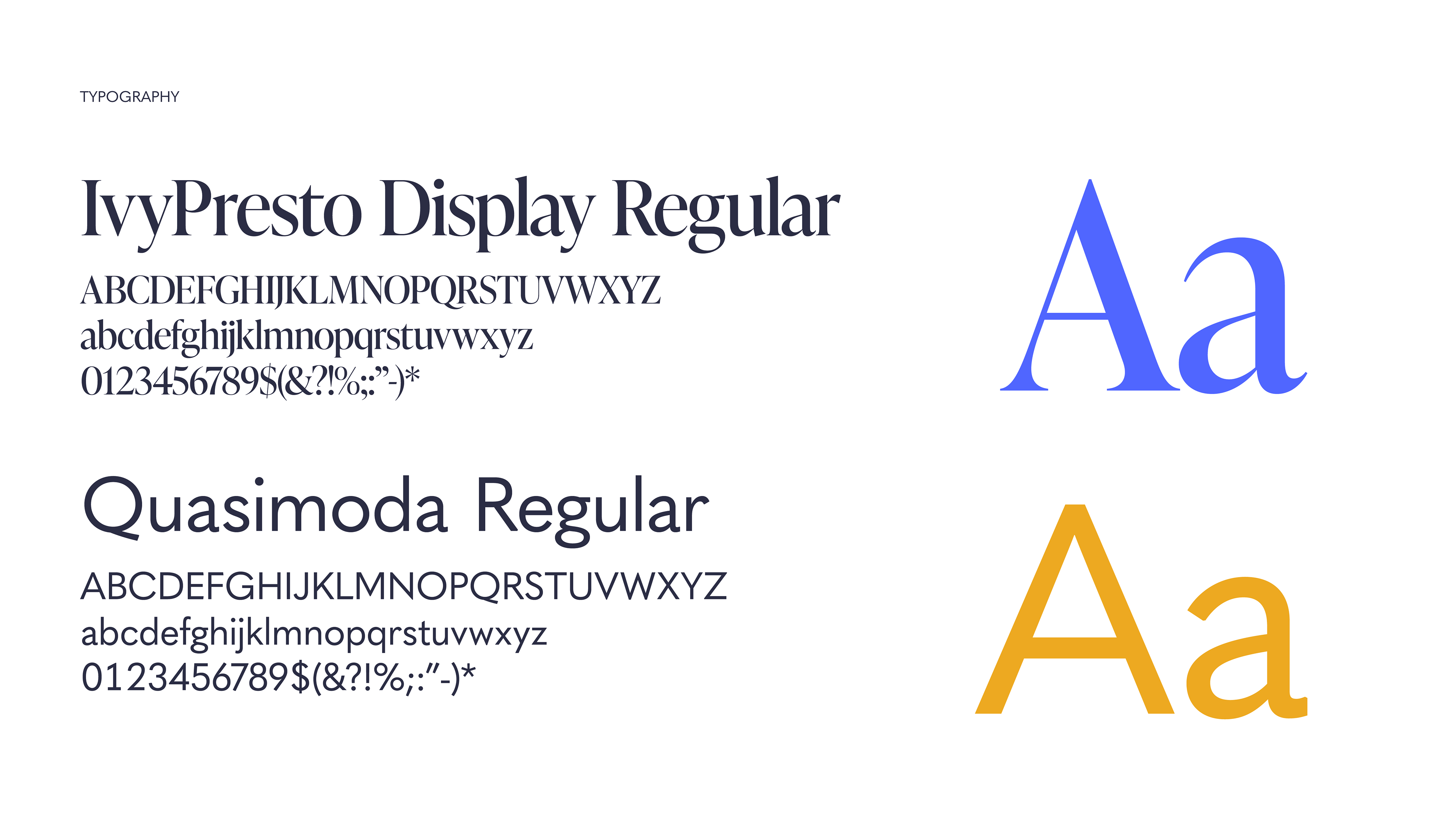
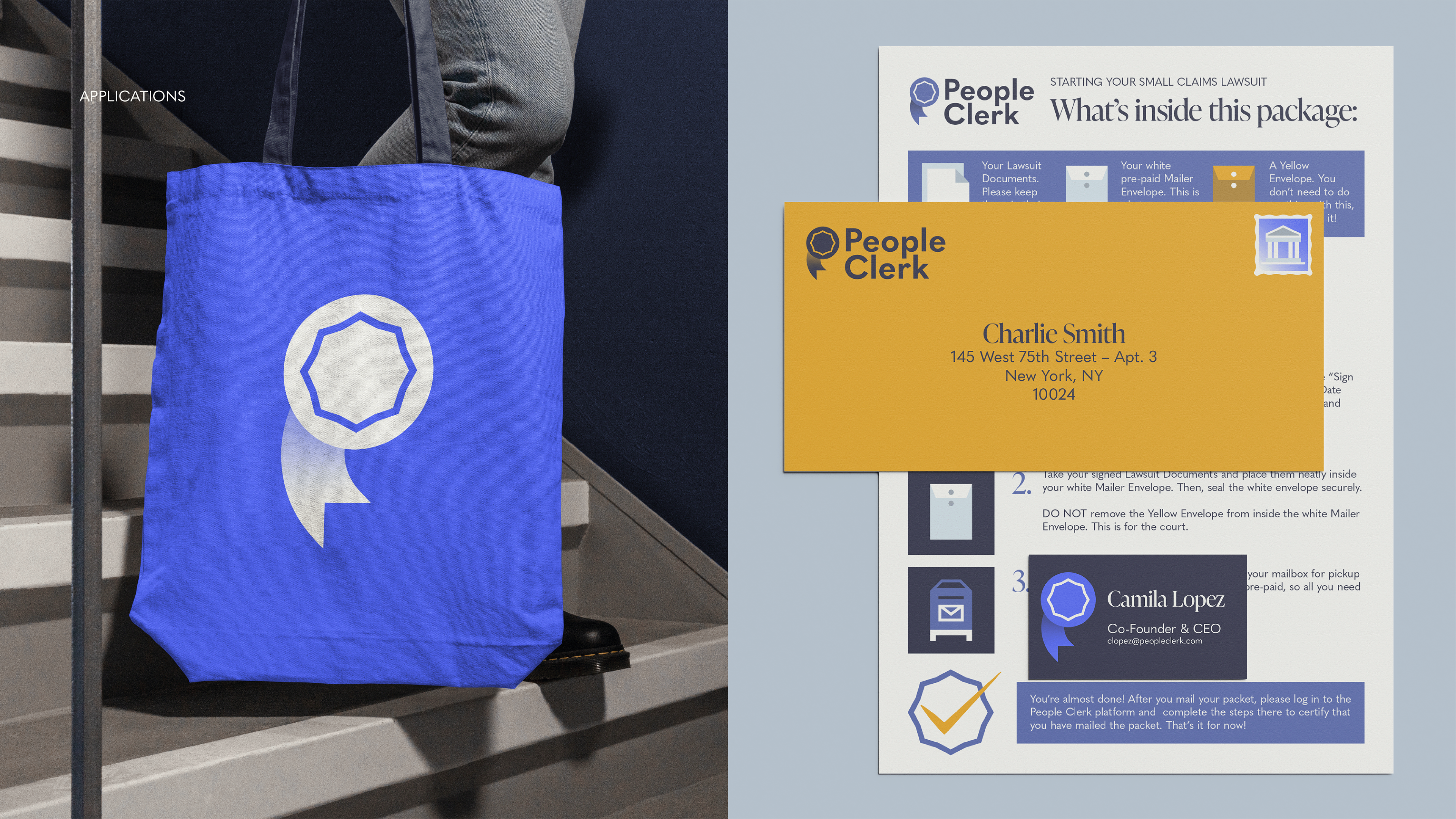
STRATEGY: Refine the brand color palette to work more seamlessly across both print and digital placements for brand cohesion, create a set of instantly-recognizable icons that relay important user actions without text, and design a logo that doubles as a "seal of authenticity," helping users feel assured in a complex and highly-regulated legal system.