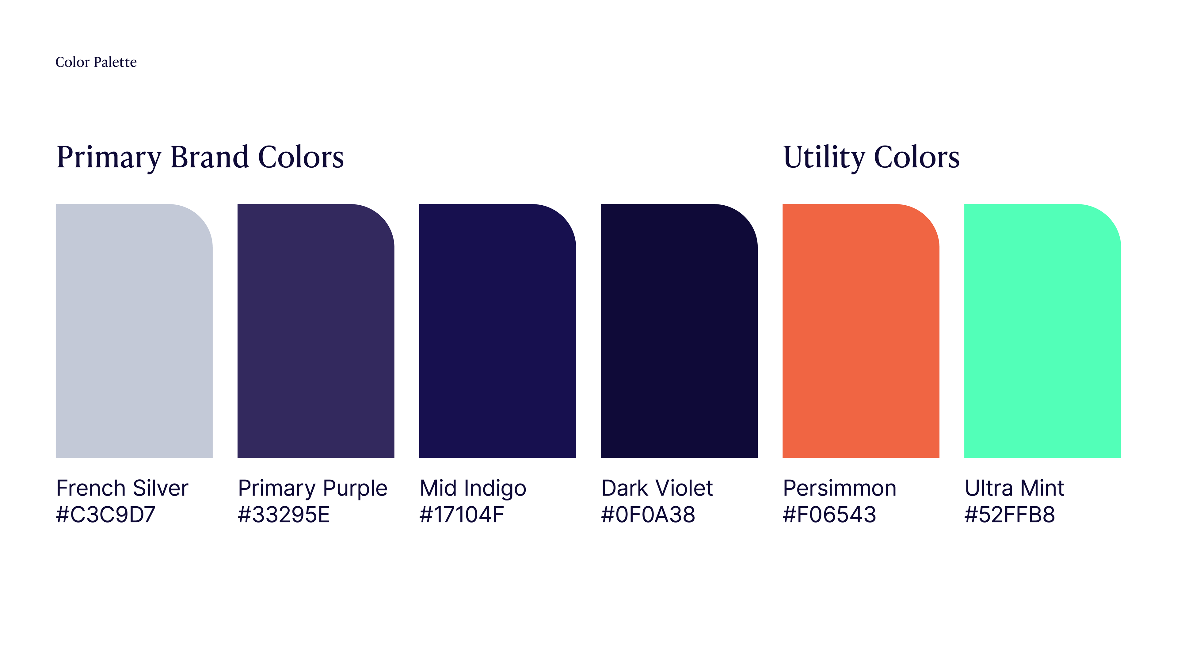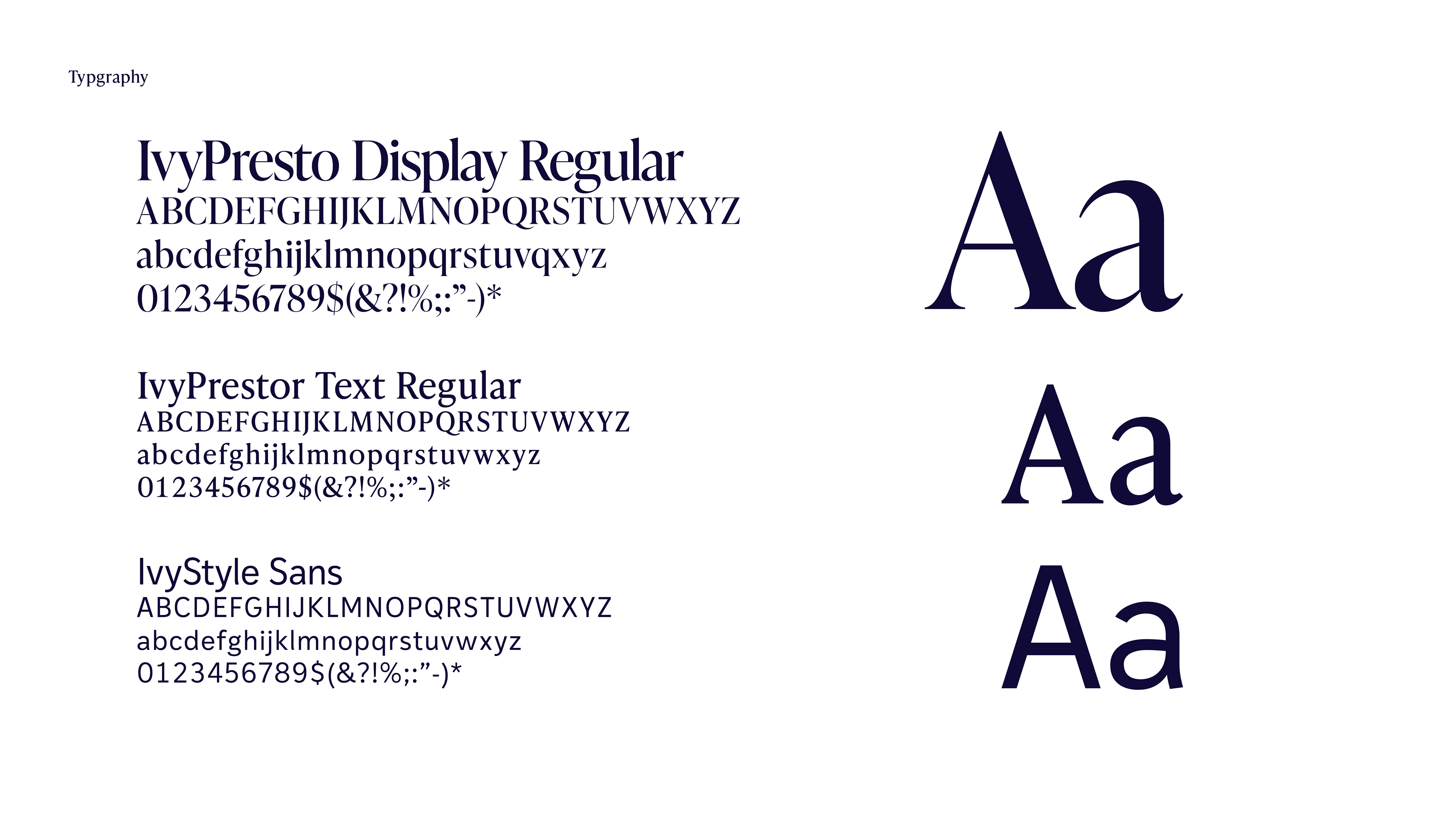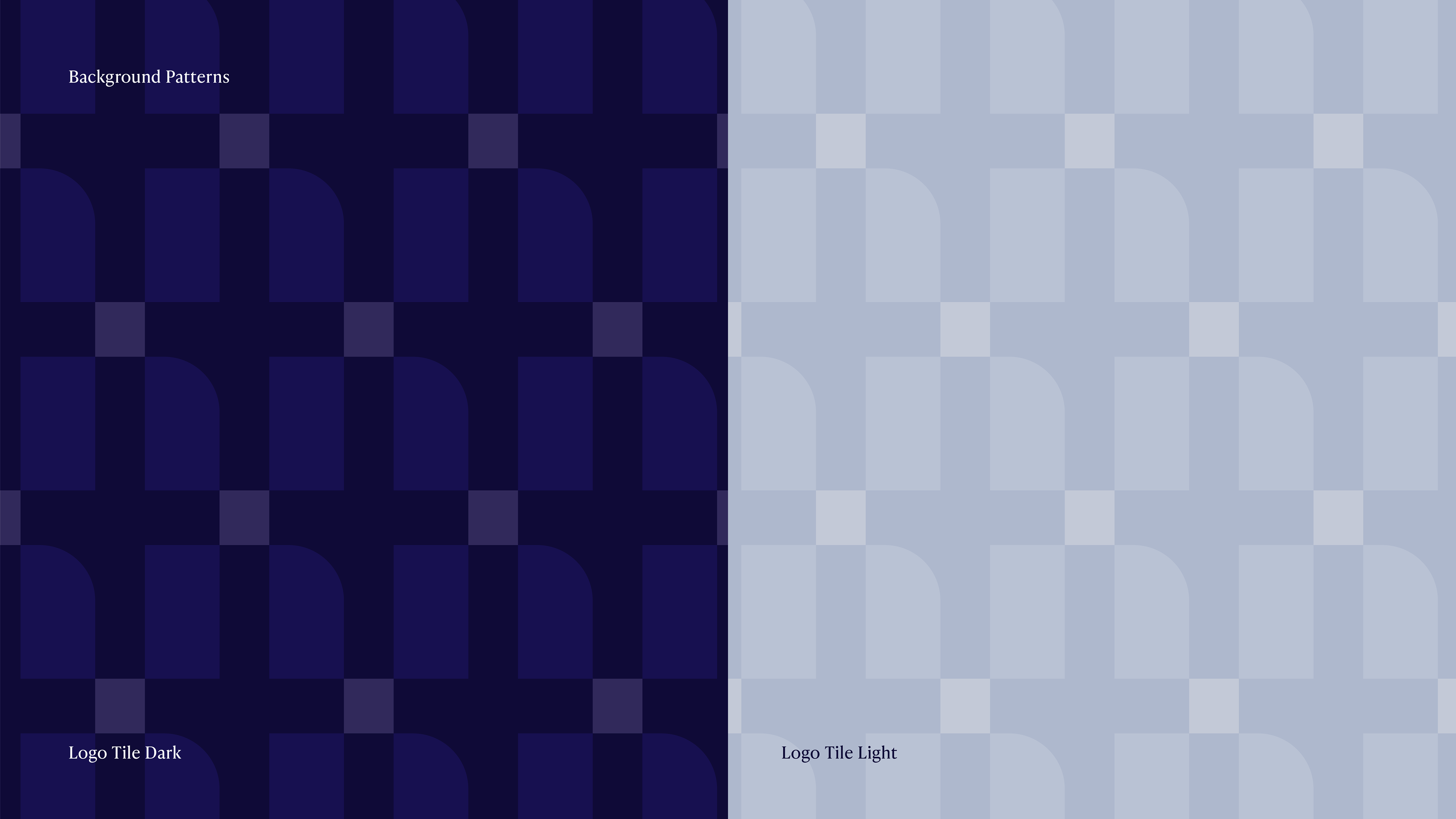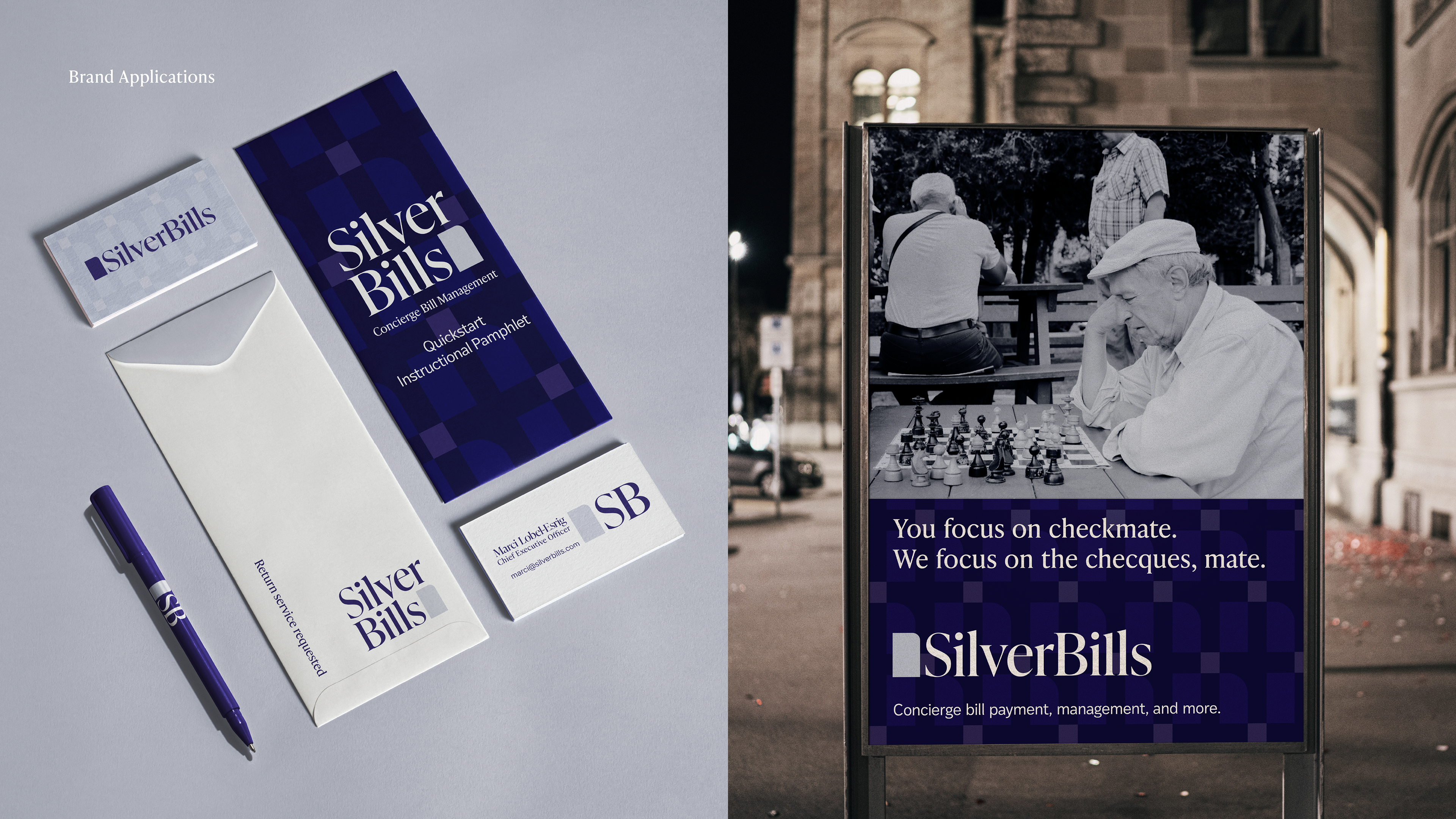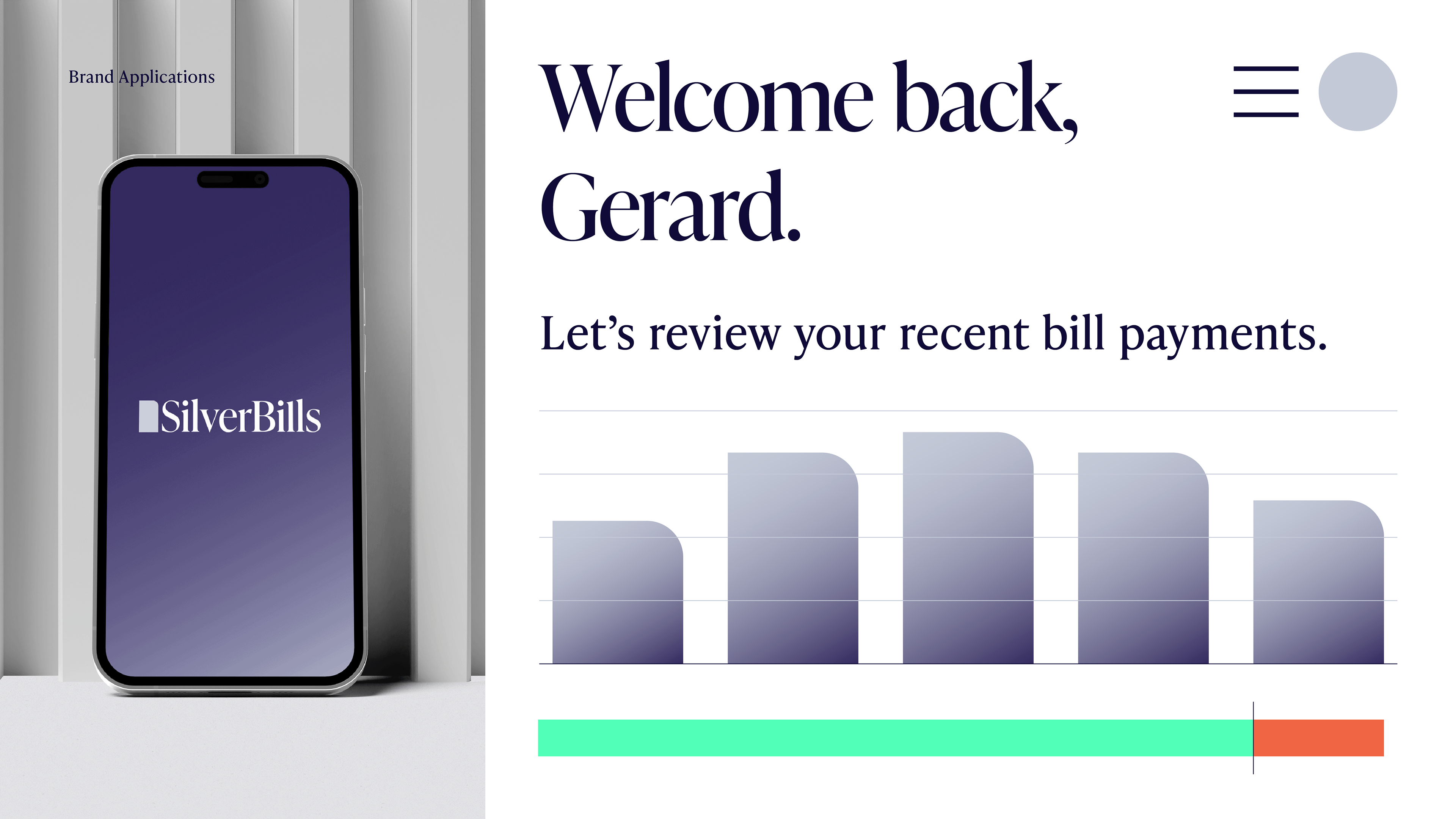
Project: Brand Refresh (Logo/Wordmark, Color Palette, Typography, Pattern)
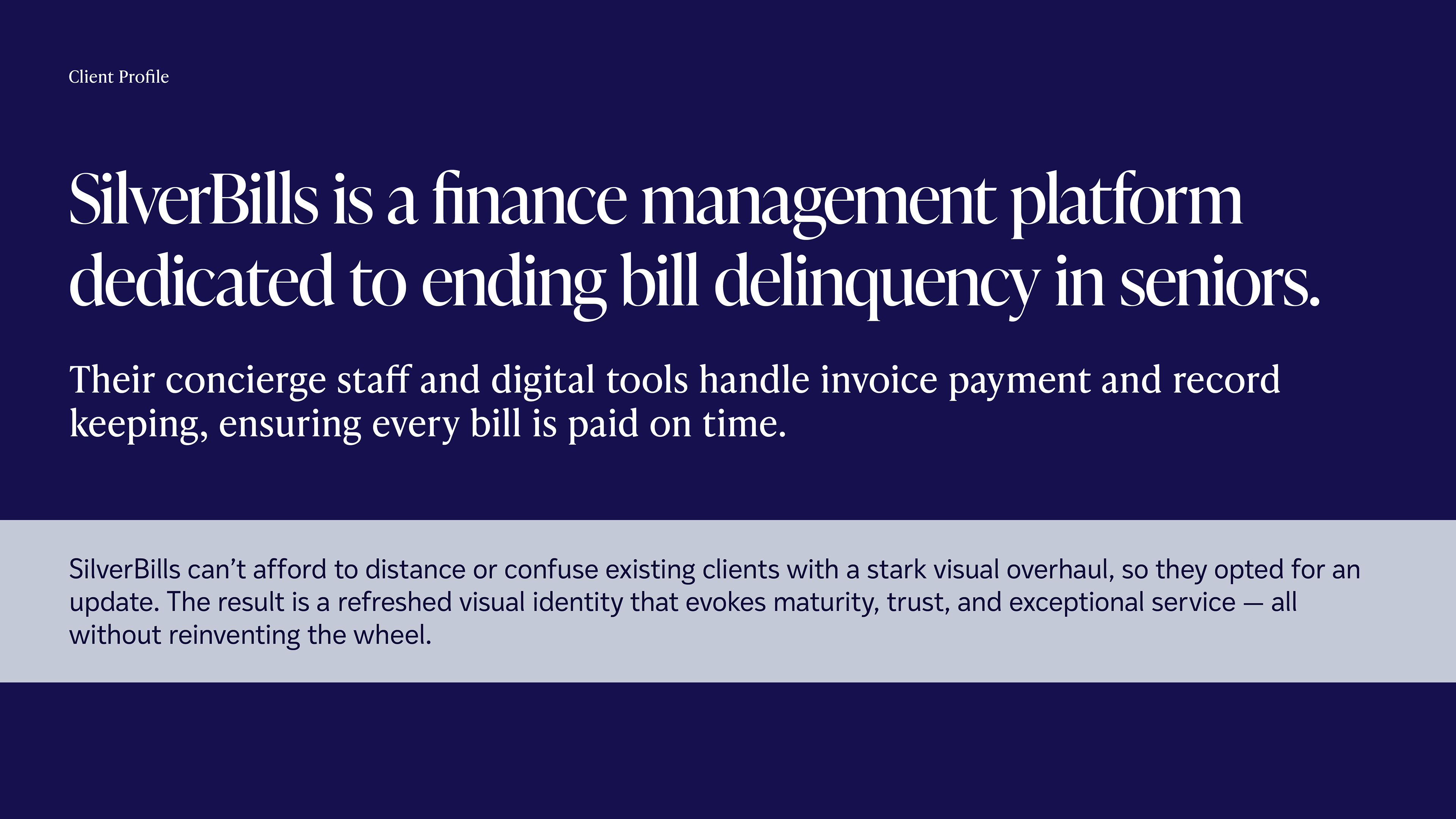
Purpose: To renew the visual identity of SilverBills — enhancing engagement, legibility, and brand value communication without sacrificing any existing brand recognition from their core audience. The revamped visual identity was optimized for the company's suite of print and digital placements, ensuring cohesion and clarity between all of its touch points.
People: Michael P. Maerlender (Designer)