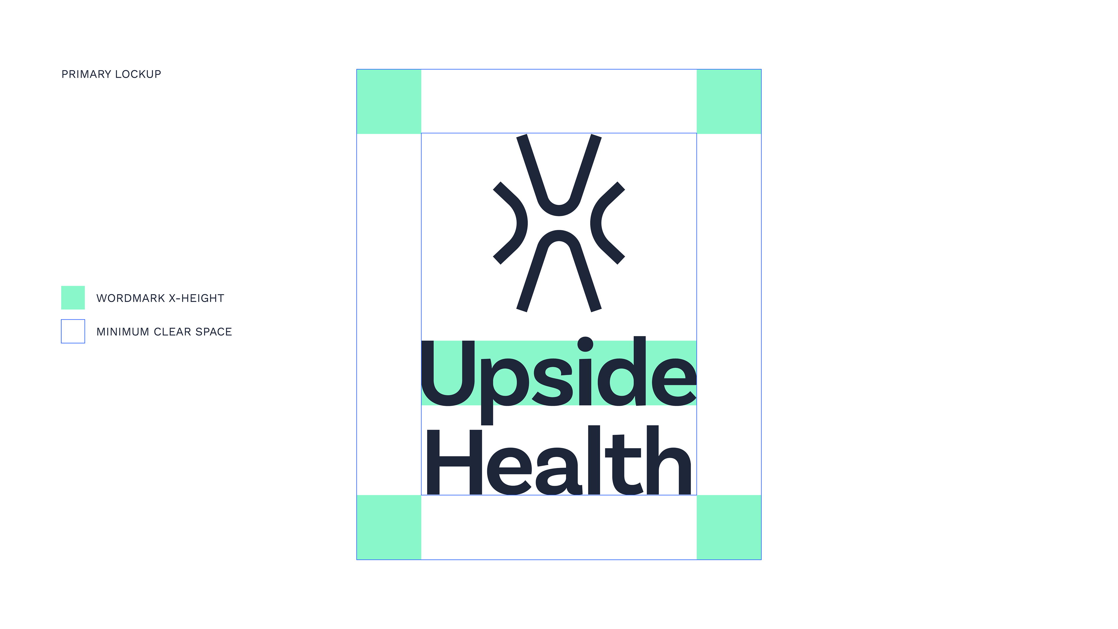
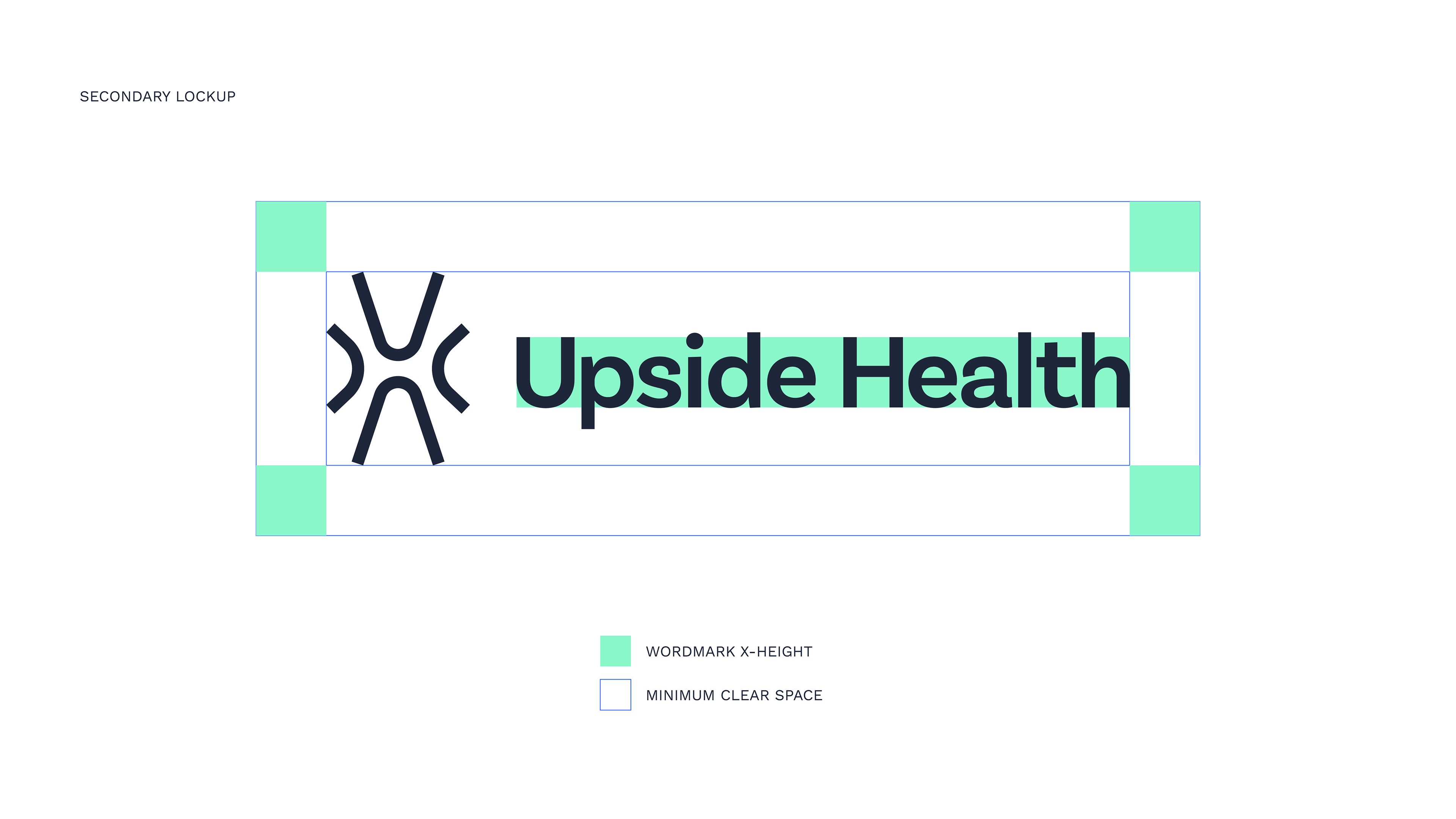
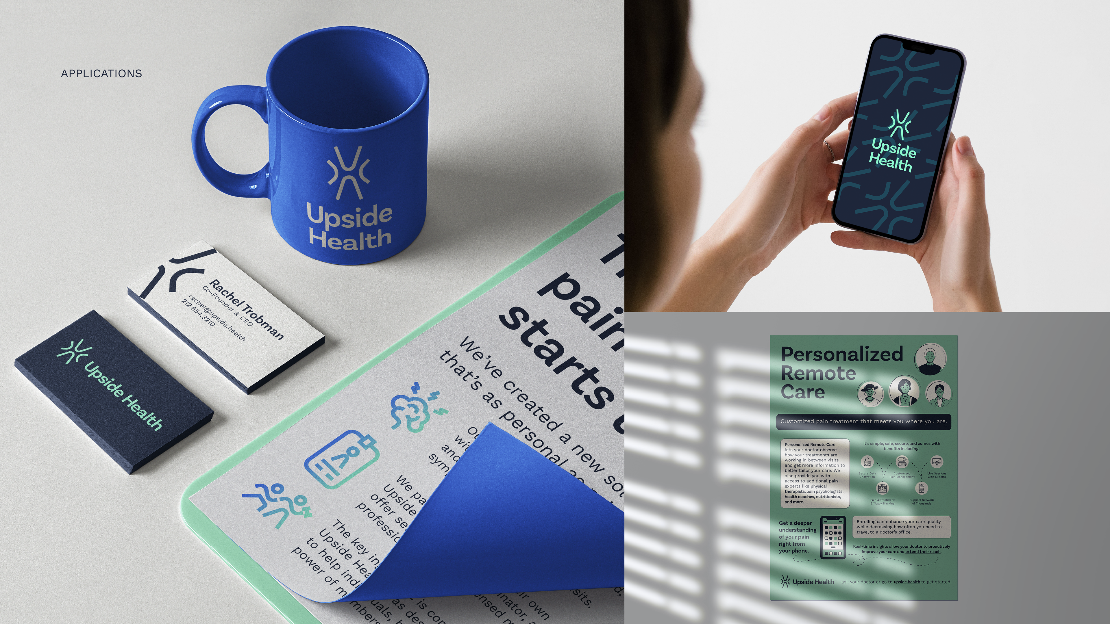
Project: Brand Refresh (Logo/Wordmark, Icon Set, Color Palette, Pattern, Typography, Collateral)
Purpose: To modernize Upside Health's branding to compete in the health SaaS space and create a more consumer-friendly design system for the rollout of their patient-facing app.
People: Michael P. Maerlender (Designer)
![](https://cdn.myportfolio.com/17453c7d-d2c4-4aaa-bbea-da4ad9474555/650d6911-9c0f-4d38-ac6a-2c742286923a_rw_3840.png?h=b1c46fc277a861c01486b78cb7f4aaff)
![](https://cdn.myportfolio.com/17453c7d-d2c4-4aaa-bbea-da4ad9474555/ea5d8286-bdd4-442e-b8d3-66ed16a0252e_rw_3840.png?h=663cf8d37ca036fd7eccf4d9c6cd688f)
![](https://cdn.myportfolio.com/17453c7d-d2c4-4aaa-bbea-da4ad9474555/2d5e2cfb-ee93-4d8d-b356-2dda5de78dba_rw_3840.png?h=f9beb6a4480275c54fa2231d73b539f1)
![](https://cdn.myportfolio.com/17453c7d-d2c4-4aaa-bbea-da4ad9474555/2fcaeee8-437c-4832-8978-96dba429b503_rw_3840.png?h=135fc070ff278ea3a8617f9186e9b041)
![](https://cdn.myportfolio.com/17453c7d-d2c4-4aaa-bbea-da4ad9474555/f216925e-6b98-492d-a809-a451e3e390af_rw_3840.png?h=4446533d3712a5daed0dee5df0d54b87)
![](https://cdn.myportfolio.com/17453c7d-d2c4-4aaa-bbea-da4ad9474555/7fdc7639-9c9d-4a00-8461-619833574209_rw_3840.png?h=6d46dbca0693a5aa6e75f2b622c012e0)
![](https://cdn.myportfolio.com/17453c7d-d2c4-4aaa-bbea-da4ad9474555/36695935-7ea4-4f38-88a4-7b2a29a7cc07_rw_3840.png?h=f68bbf717d208917e0a34f024d903759)
![](https://cdn.myportfolio.com/17453c7d-d2c4-4aaa-bbea-da4ad9474555/45ef6727-6dbb-442c-92a1-7e98e71704a7_rw_3840.png?h=5415729cd8806acdc46bdde34bc81329)
![](https://cdn.myportfolio.com/17453c7d-d2c4-4aaa-bbea-da4ad9474555/7268a4b9-aa26-4f6f-8956-4630e167fdf1_rw_3840.png?h=bd9eeb05fd88b5567b0ef076baaab6fc)
![](https://cdn.myportfolio.com/17453c7d-d2c4-4aaa-bbea-da4ad9474555/fe15f18d-aa2f-4b8a-aa64-a8261f4ccde5_rw_3840.png?h=0a635737d3984e6a79d5f84921f78c61)
![](https://cdn.myportfolio.com/17453c7d-d2c4-4aaa-bbea-da4ad9474555/f35e345a-e195-4d9a-9ca8-e7b1c4d38fe3_rw_3840.png?h=2482ede95f9808aa7c0163c052204fe5)
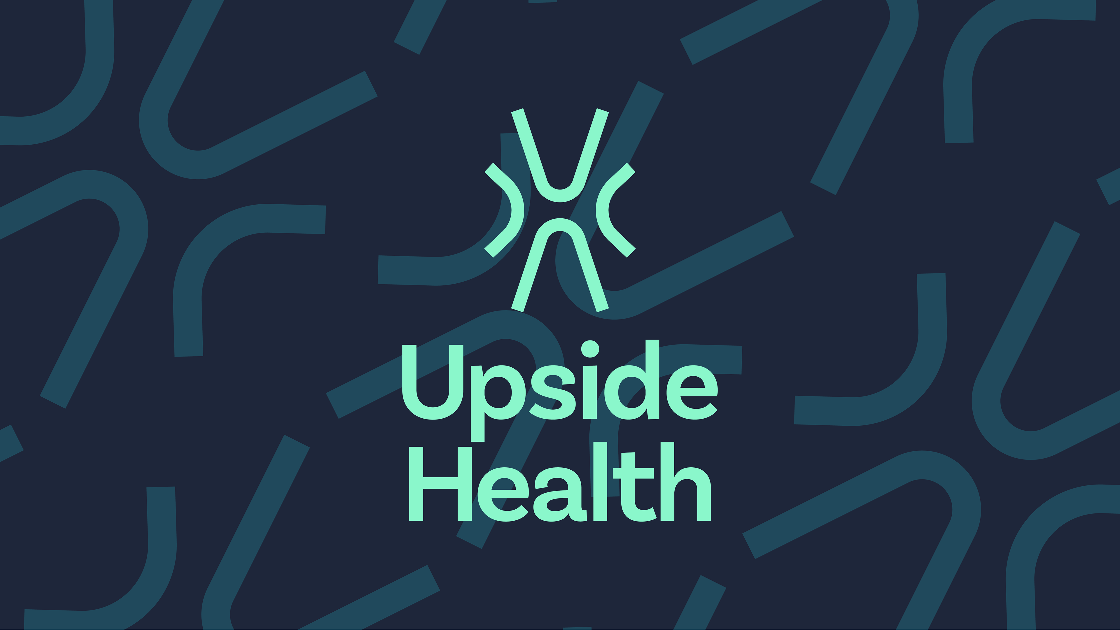
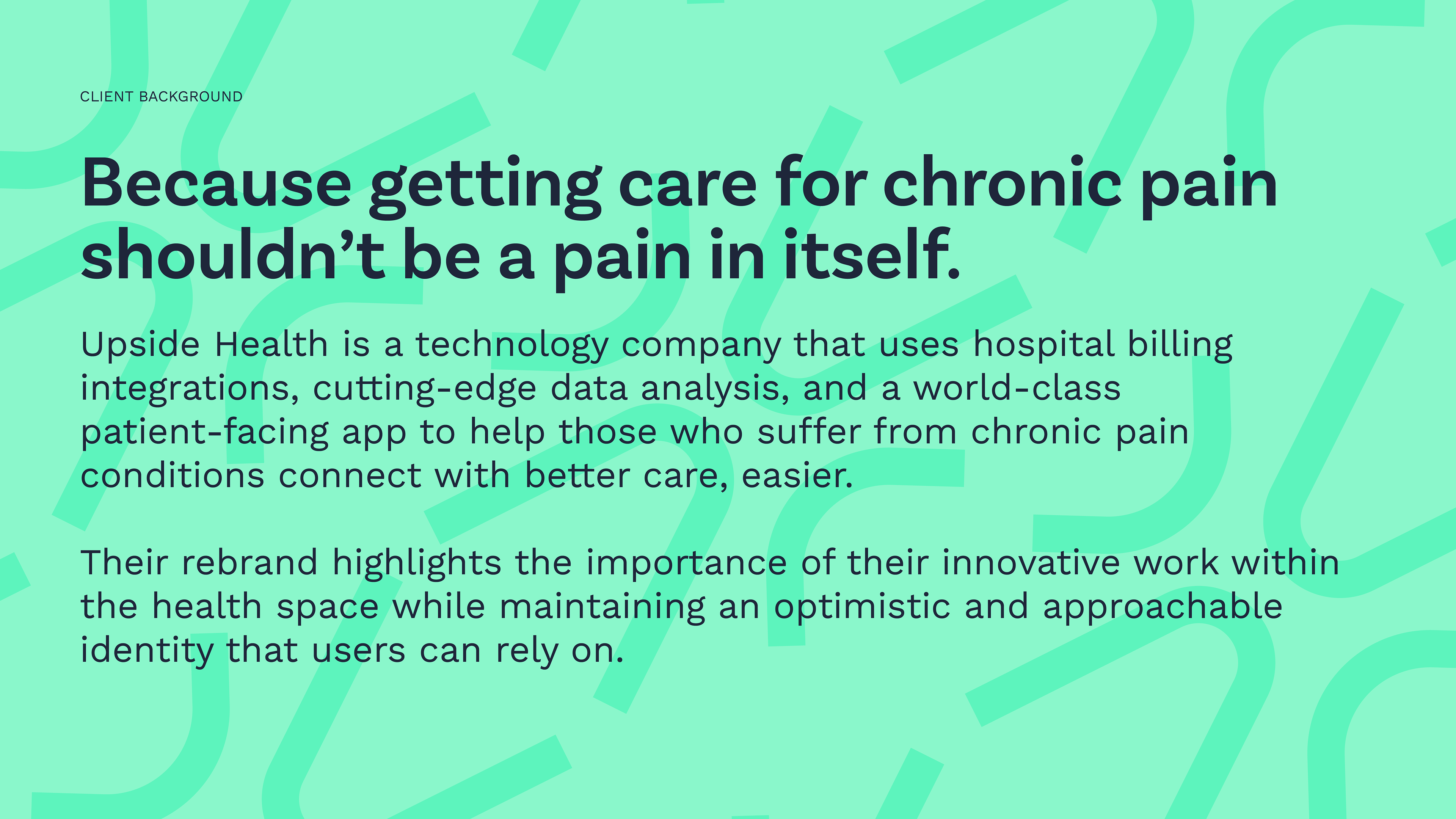
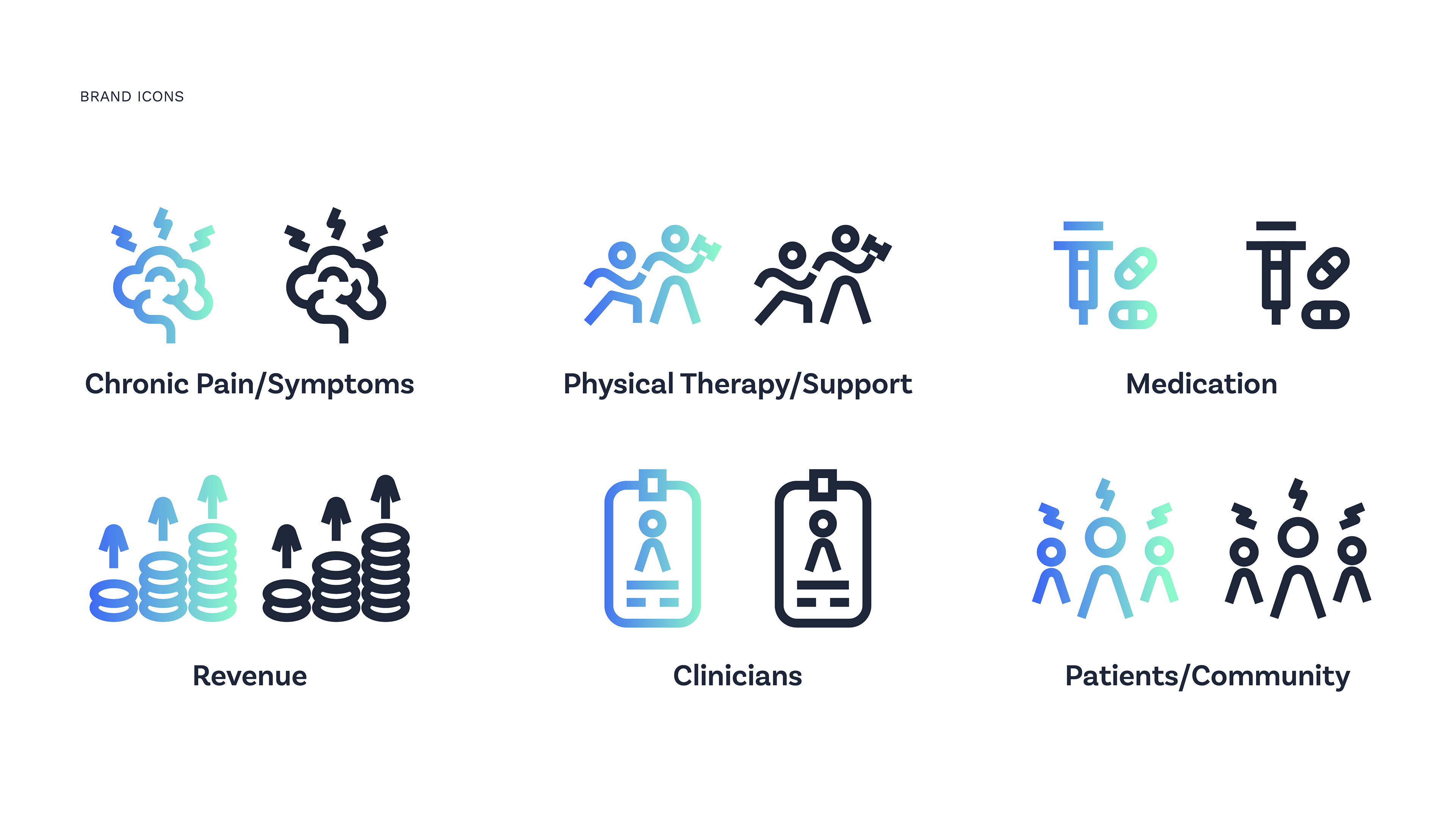
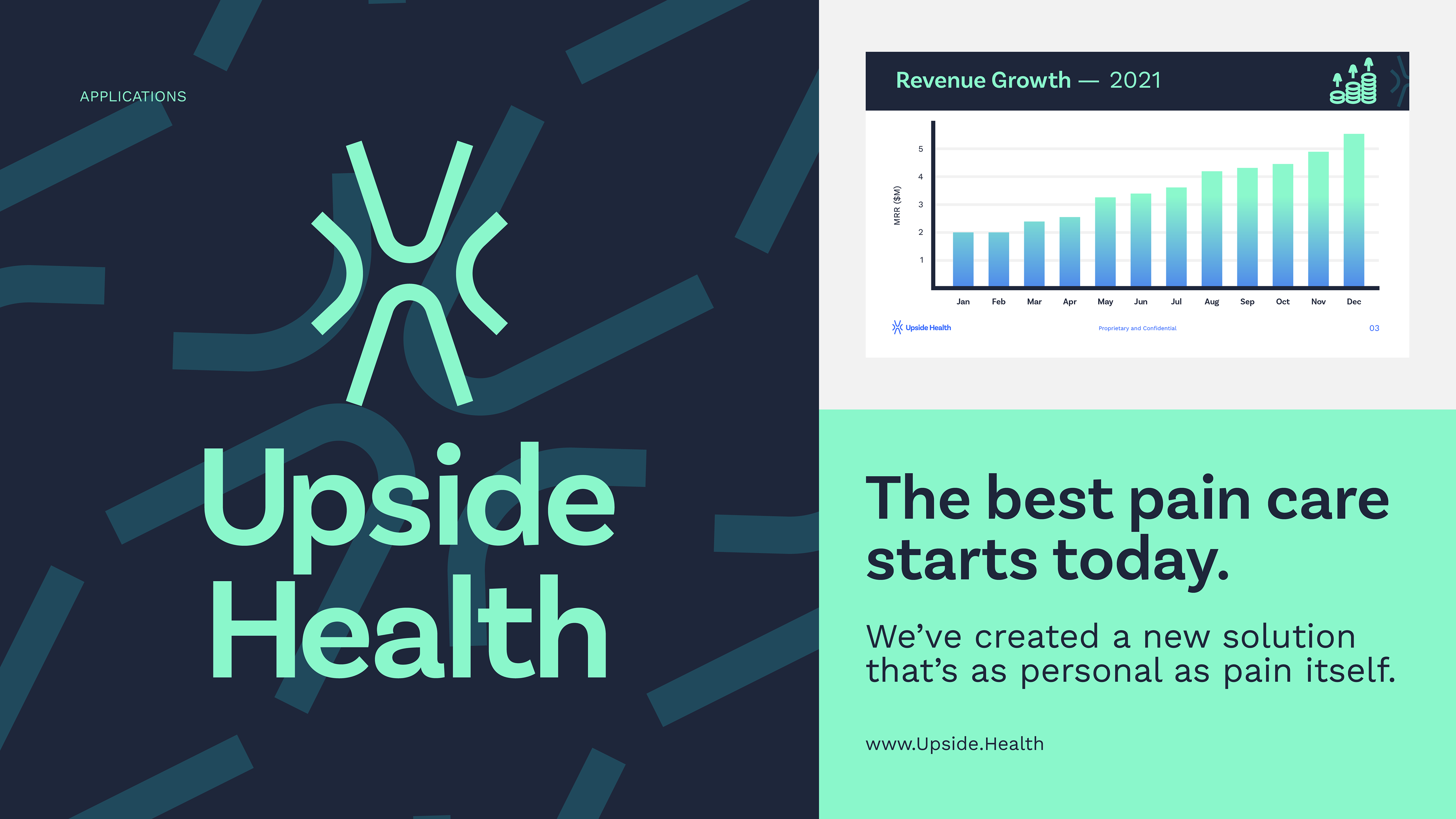
Upside Health is a company that builds digital health solution for chronic pain patients and clinicians, leveraging technology to increase transparent communication while lowering burden. The identity was designed to evoke optimism, innovation, and acknowledgement of the severity of chronic pain conditions.
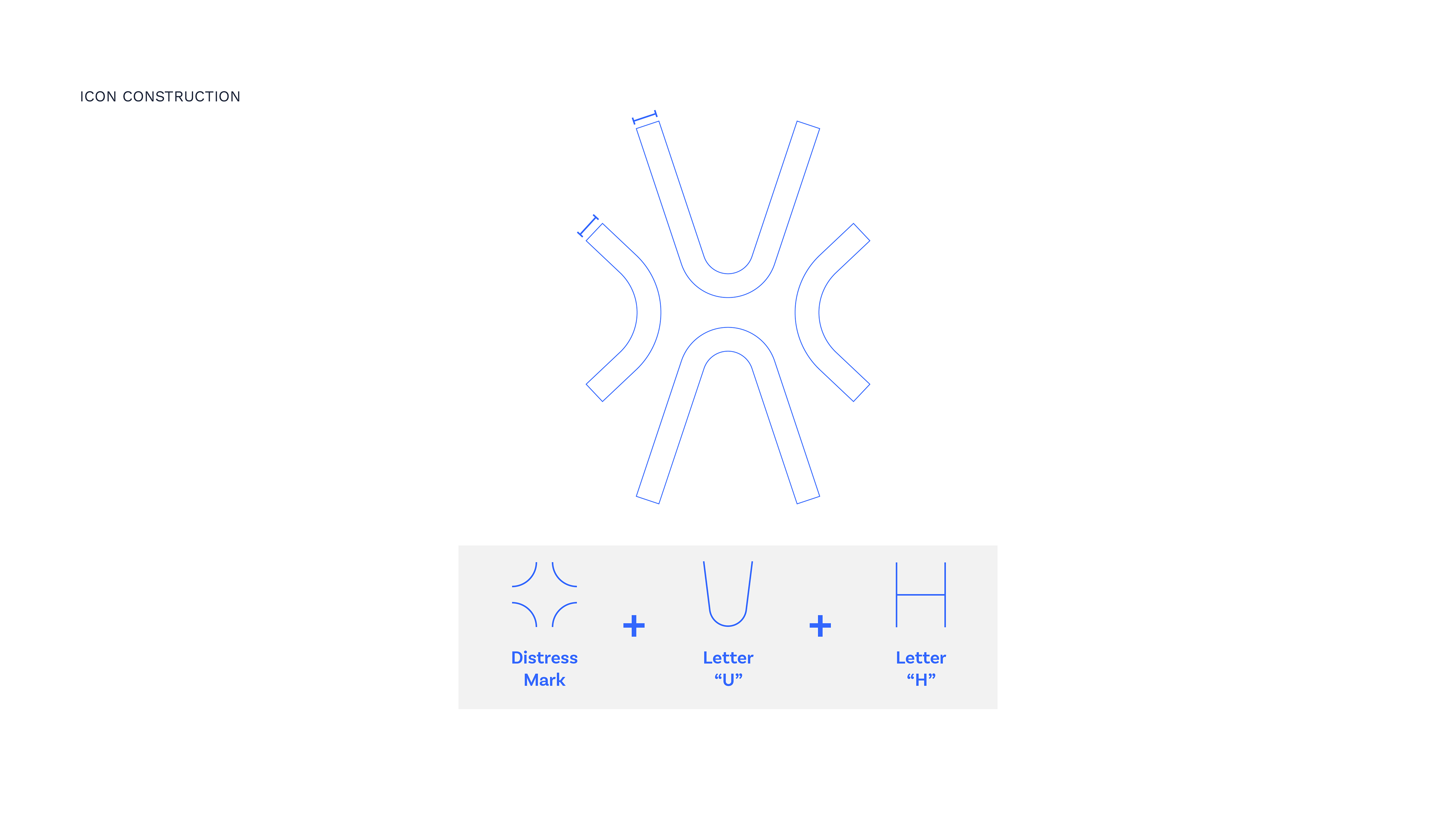
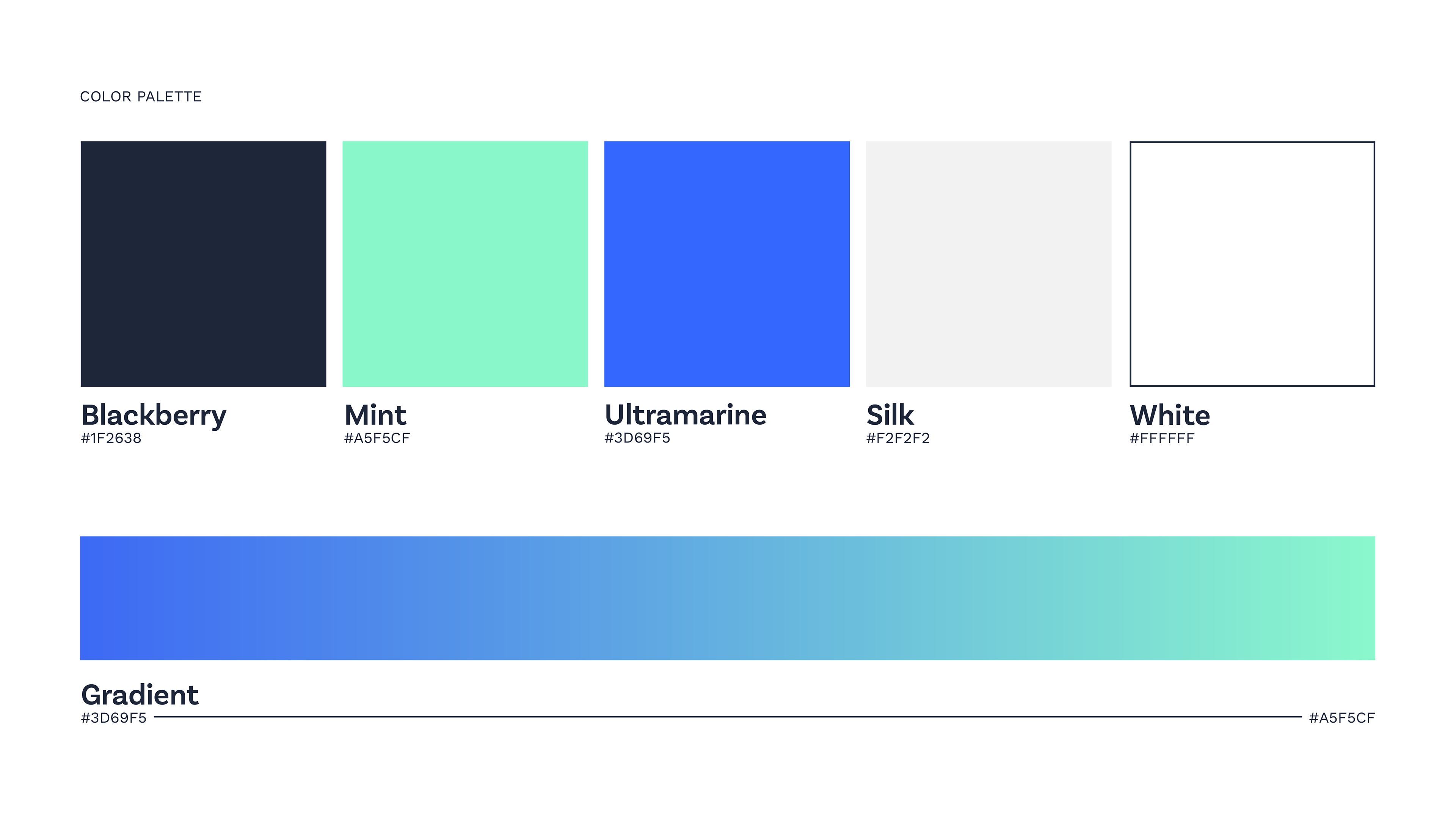
STRATEGY: Update the brand palette for a fresher and more vibrant feel with higher contrast for use across product UI, and create a new icon that visually represents the concept of a "pain point" to make patients feel seen, all using a shape system that's modern and clean, yet friendly.